Western Union Mobile App Onboarding
Designing a clearer welcome experience that communicates value, builds trust, and guides users into the money-transfer journey
Western Union was focused on improving the mobile customer experience and attracting new customers. At the time, the app did not have a dedicated welcome or onboarding experience, creating an opportunity to introduce the product’s value before users entered key tasks such as signing in, registering, or sending money.
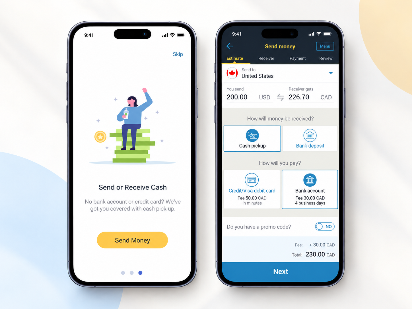
I helped design a new onboarding experience that introduced Western Union’s key benefits through a short, visual journey while giving users clear paths to Send Money, Log In, or Sign Up.
01 — Understand
WHY ONBOARDING MATTERSThe welcome experience is one of the first opportunities a product has to explain its value. Rather than immediately asking customers to register or complete a transaction, the onboarding experience could help users understand what Western Union provides and why the service might be useful to them.
The experience therefore needed to balance education and action—communicating enough value to build confidence while allowing users to quickly continue.
02 — Research
USER INTERVIEWSTo understand customers' expectations and behaviors, I conducted interviews with 10 participants:
- 5 existing Western Union customers
- 5 potential customers
The research focused on understanding their overall experience with money-transfer applications and determining whether a more comprehensive onboarding experience could address their needs.
The research helped us frame the onboarding around the questions new customers naturally have when encountering the product:
- Can I trust this service?
- Can I use it where I need it?
- How can I send or receive money?
03 — Competitive Analysis
Since Western Union did not previously have this feature, I reviewed onboarding experiences from five competitors:

The takeaways can be summarized into the following categories:
-
Welcome Experience
TransferWise, Remitly, and WorldRemit have comprehensive welcome experience when a user first launches the product.
-
Signup Wall
TransferWise, WorldRemit, and Xoom require users to have an account before being able to initiate a money transfer.
-
Social Media Login
TransferWise allows Apple ID and social media logins. Xoom allows users to use their PayPal account login.
-
Registration Process
TransferWise, WorldRemit, Remitly, and MoneyGram have a simple process that requires 4 data inputs (country, state, email, and password). MoneyGram has a lengthy registration process.
-
Other Onboarding Methods
TransferWise and Remitly use dashboard, notification widgets, and progress meter as additional onboarding
04 — Content Strategy
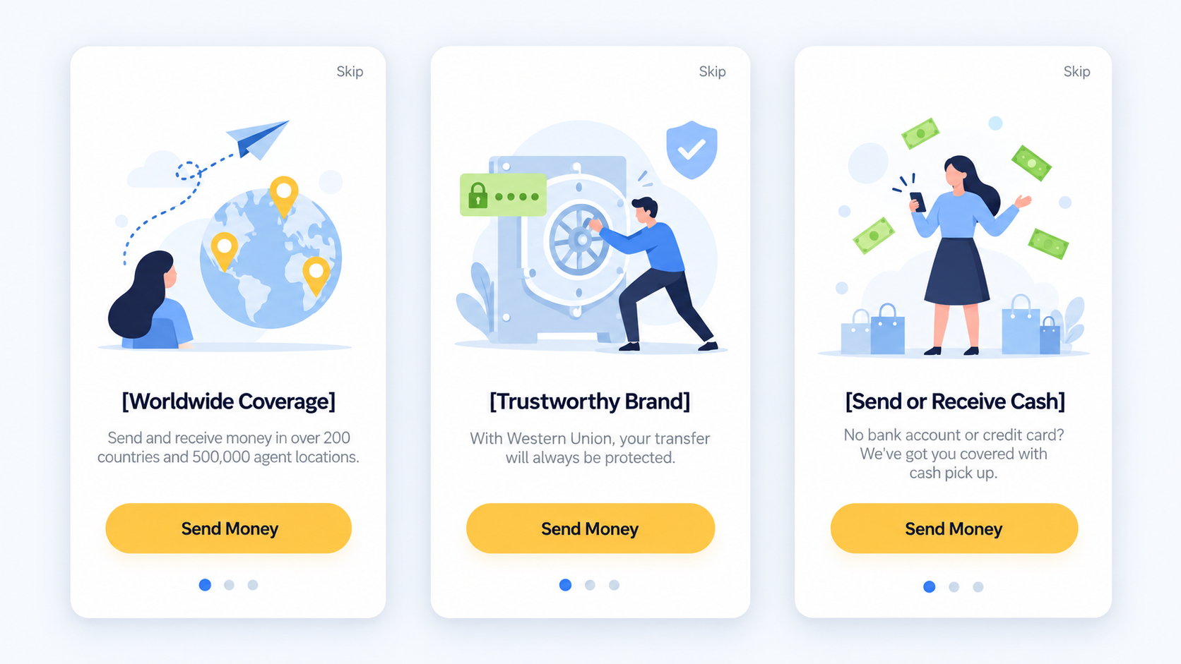
Working closely with the Content Strategist, we focused the experience on three core dimensions of Western Union's value proposition.
-
Worldwide Coverage
Communicate the scale and accessibility of Western Union's global network.
-
Trustworthy Brand
Reinforce Western Union's history and credibility as a money-transfer provider.
-
Flexible Ways to Send & Receive Money
Help customers understand that money could be received through options such as cash pickup, supporting users who may not rely exclusively on bank accounts or cards.
This gave every onboarding screen a clear purpose instead of presenting users with generic promotional content.
05 — Ideate and Create
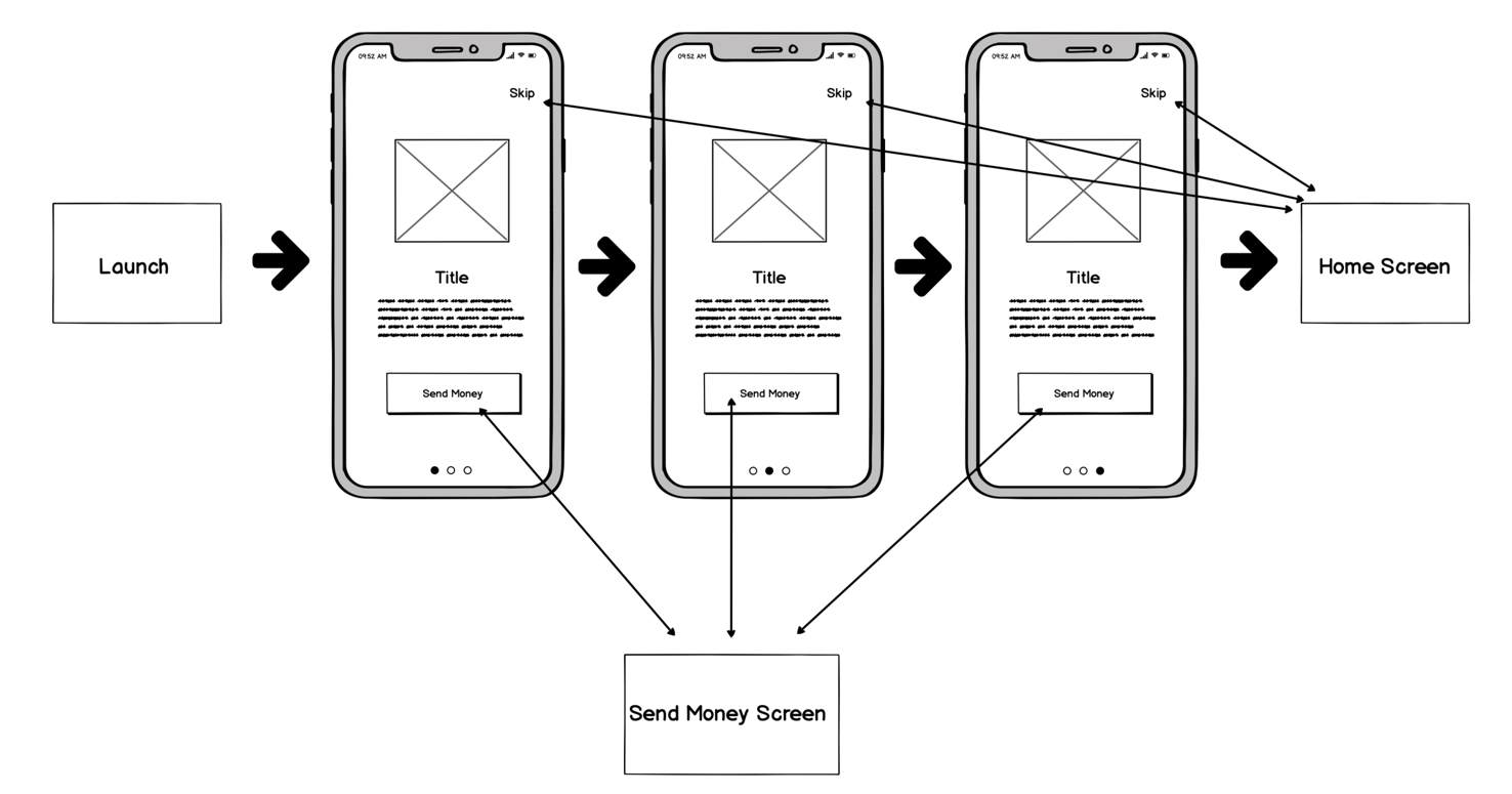
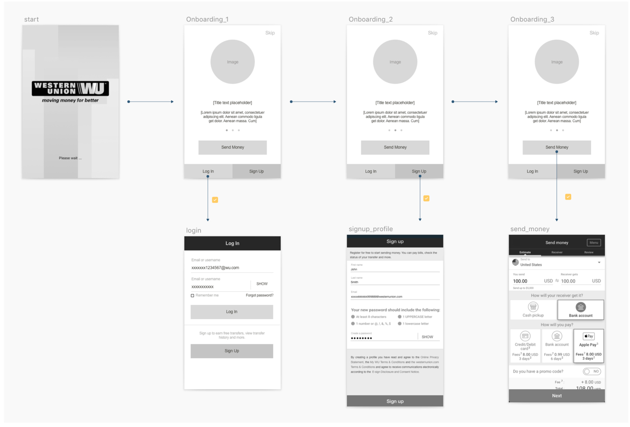
IDEATION and UX FLOWWe came up with the UX flow under the assumption that people would either complete the onboarding experience or get redirected to other areas of the product.
DESIGN ITERATION
For the first iteration, I explored a storytelling-driven approach intended to make the experience more engaging and emotionally meaningful rather than presenting onboarding as a series of instructional screens.
ENGINEERING COLLABORATION
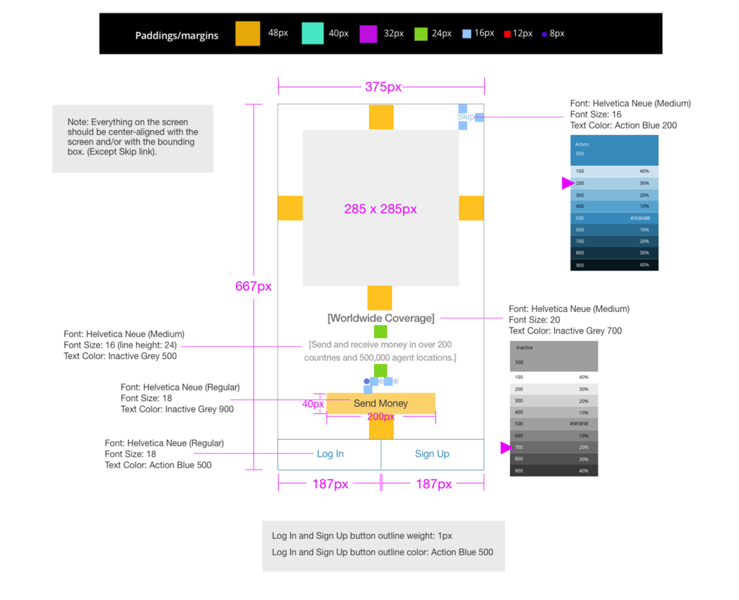
Once the experience was finalized, we provided templates and detailed design specifications to the engineering team to support implementation.
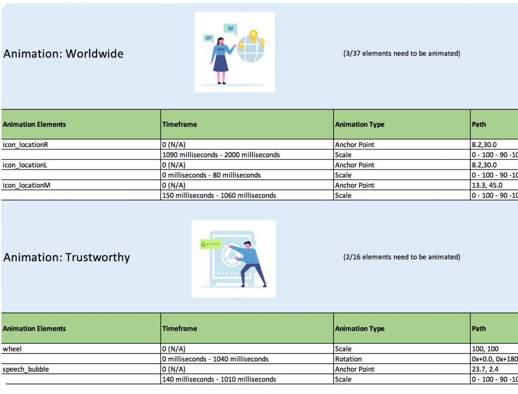
Animations were also incorporated into the final illustrations to better communicate the ideas behind each value proposition.
06 — From Previous Experience to New Concept
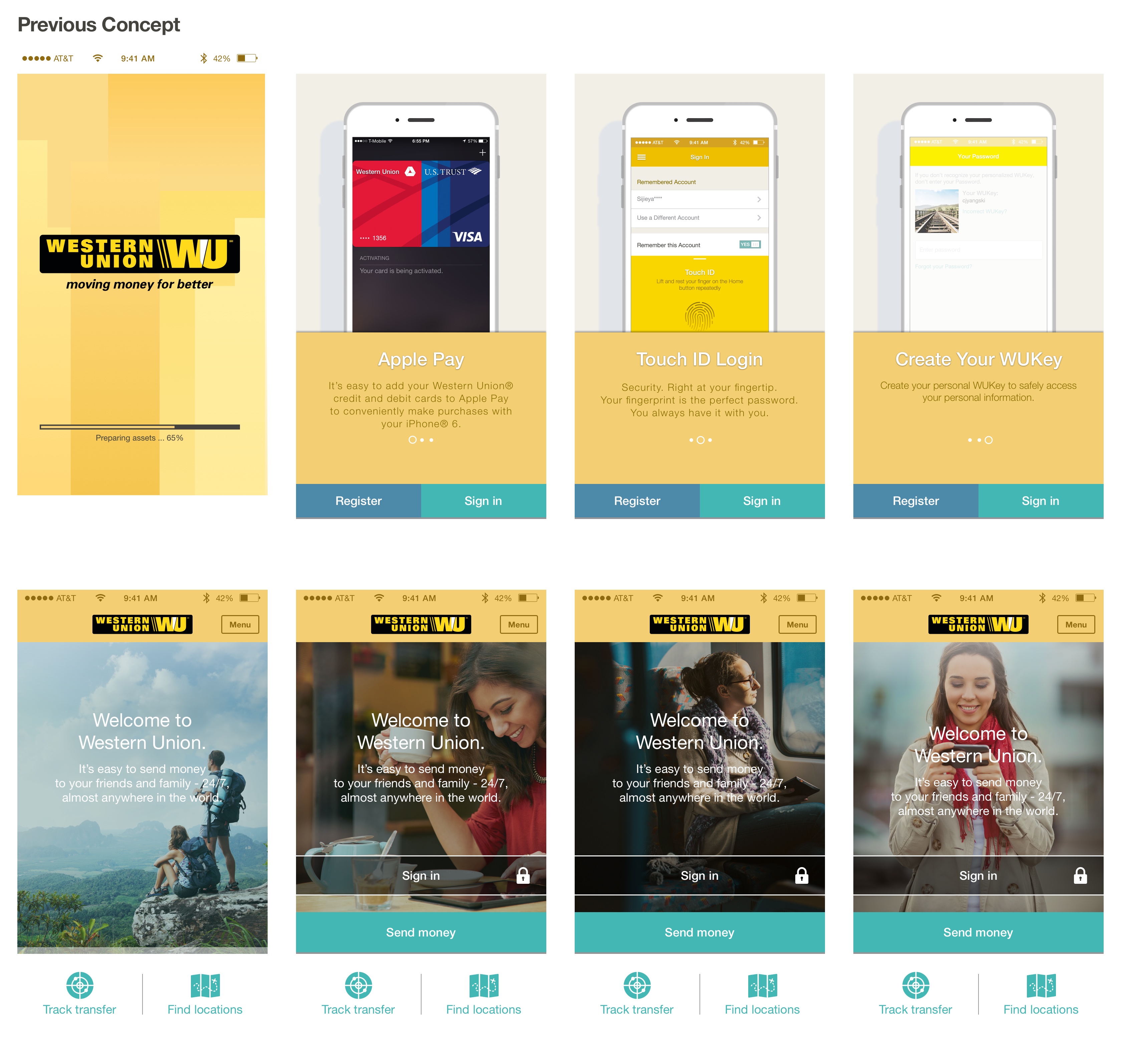
PREVIOUS CONCEPTThe earlier experience relied heavily on large lifestyle imagery and promotional messaging. Authentication and promotional functions competed for attention, while the overall experience provided less structured guidance about the broader value of the product.
NEW CONCEPT
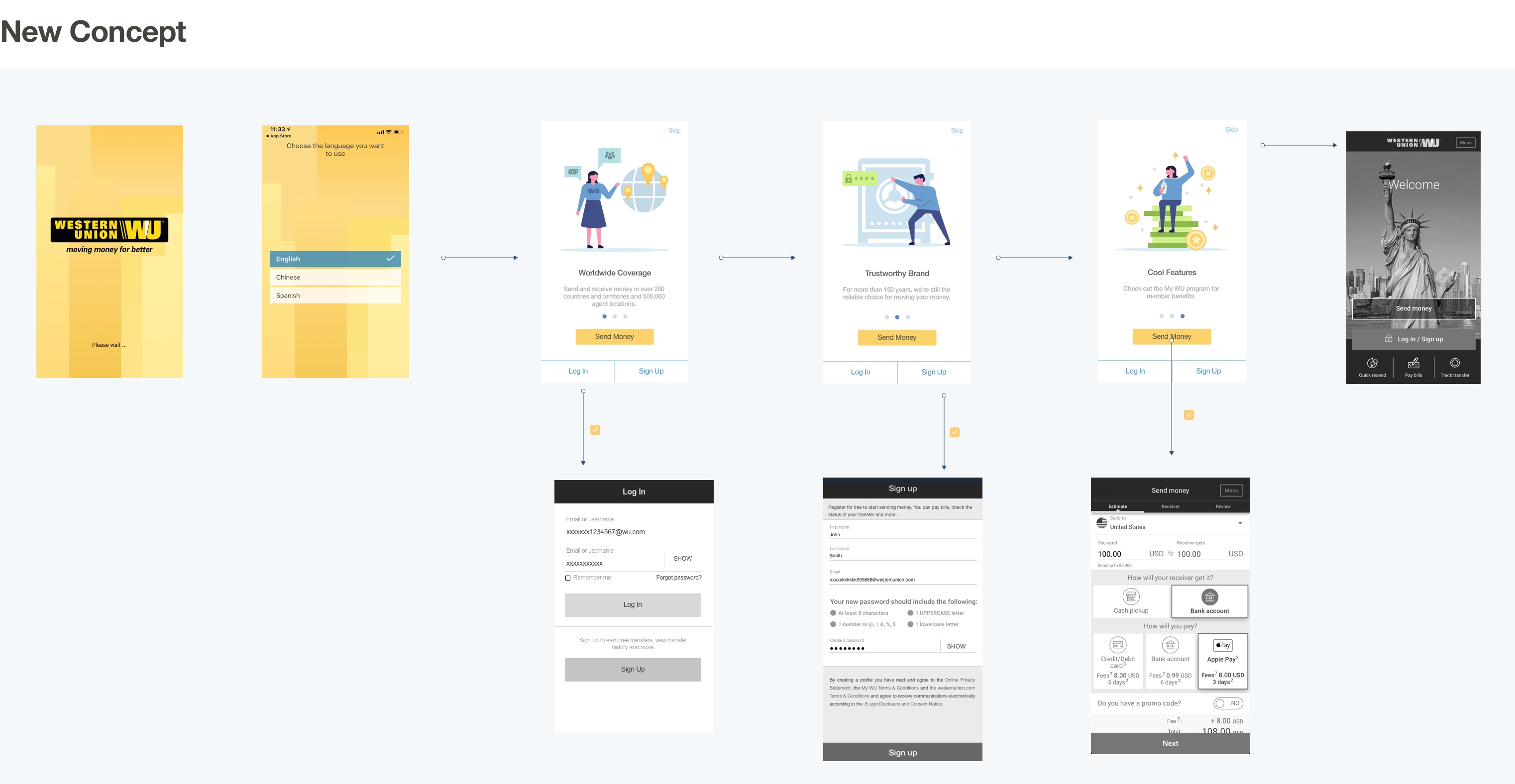
The redesigned experience introduced a more intentional progression:
Launch → Language Selection → Product Value → Product Value → Product Value → Send Money / Log In / Sign Up
06 — What I Learned
One of the biggest lessons from this project was that creating a seemingly simple onboarding experience requires significant cross-functional coordination.
The complete project—from the initial pitch through release—took roughly six months, with legal and compliance reviews creating multiple rounds of content revision. Technical limitations around SVG animation also required the team to adapt the implementation approach.
The experience reinforced the importance of involving content, engineering, legal, and compliance partners early, particularly when designing customer-facing experiences for a financial-services product.