Amazon PayCode
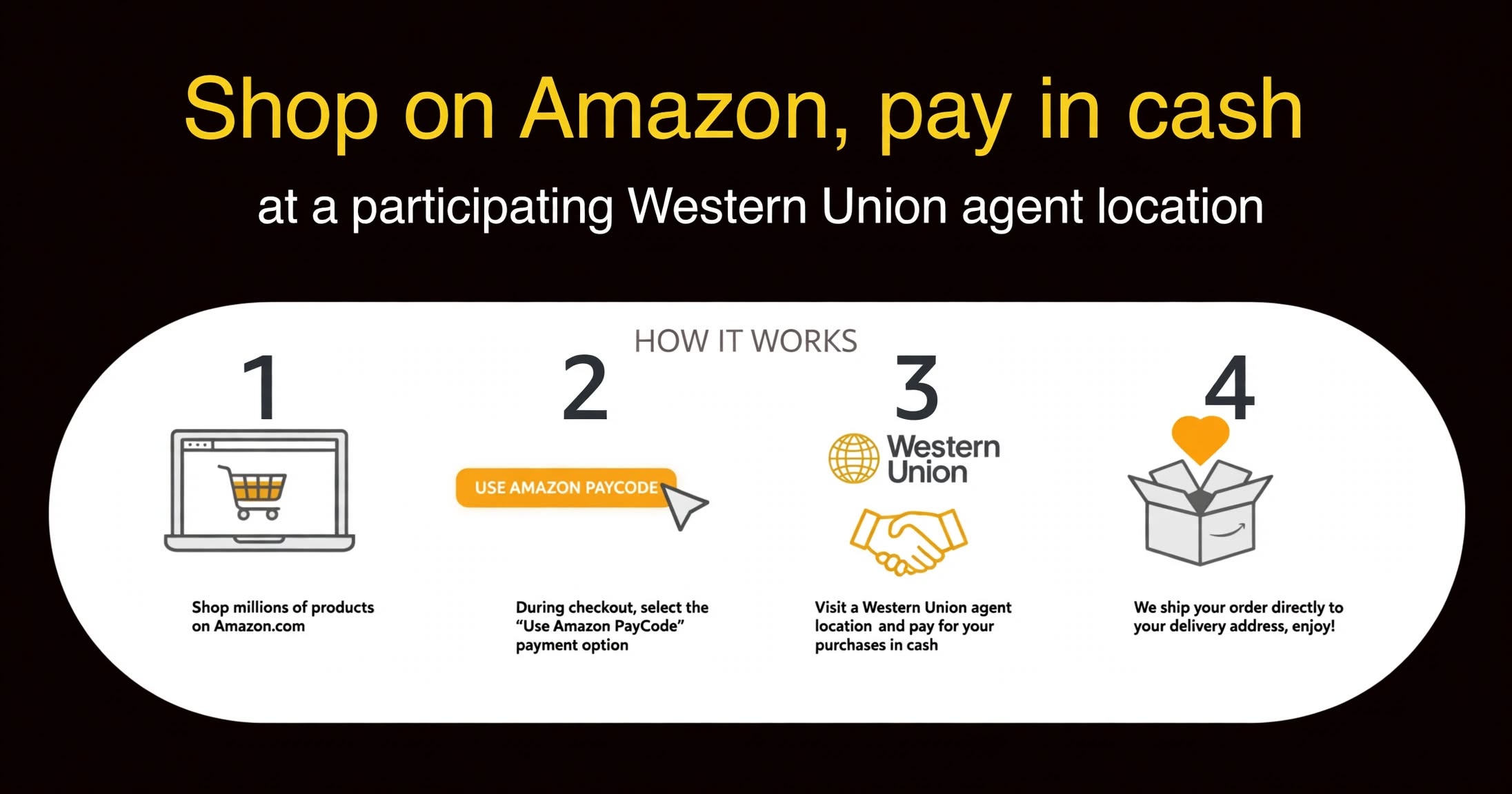
Amazon PayCode ("Buy global, pay local") lets shoppers pay for Amazon orders in cash. A customer checks out online, then pays at a nearby participating Western Union agent location; once paid, the order ships to the address given at checkout. The agent's screen is where that cash payment happens, so its usability decides how smoothly the whole service runs.
GOAL
Improve the existing experience by simplifying the user flow, removing unnecessary content and making the send-money experience more immersive.
CHALLENGE
Define the scope and technical limits, make efficient use of limited resources and budget, and above all make the experience simple and adaptive enough that agents need no initial training.
01 — Research & Discovery
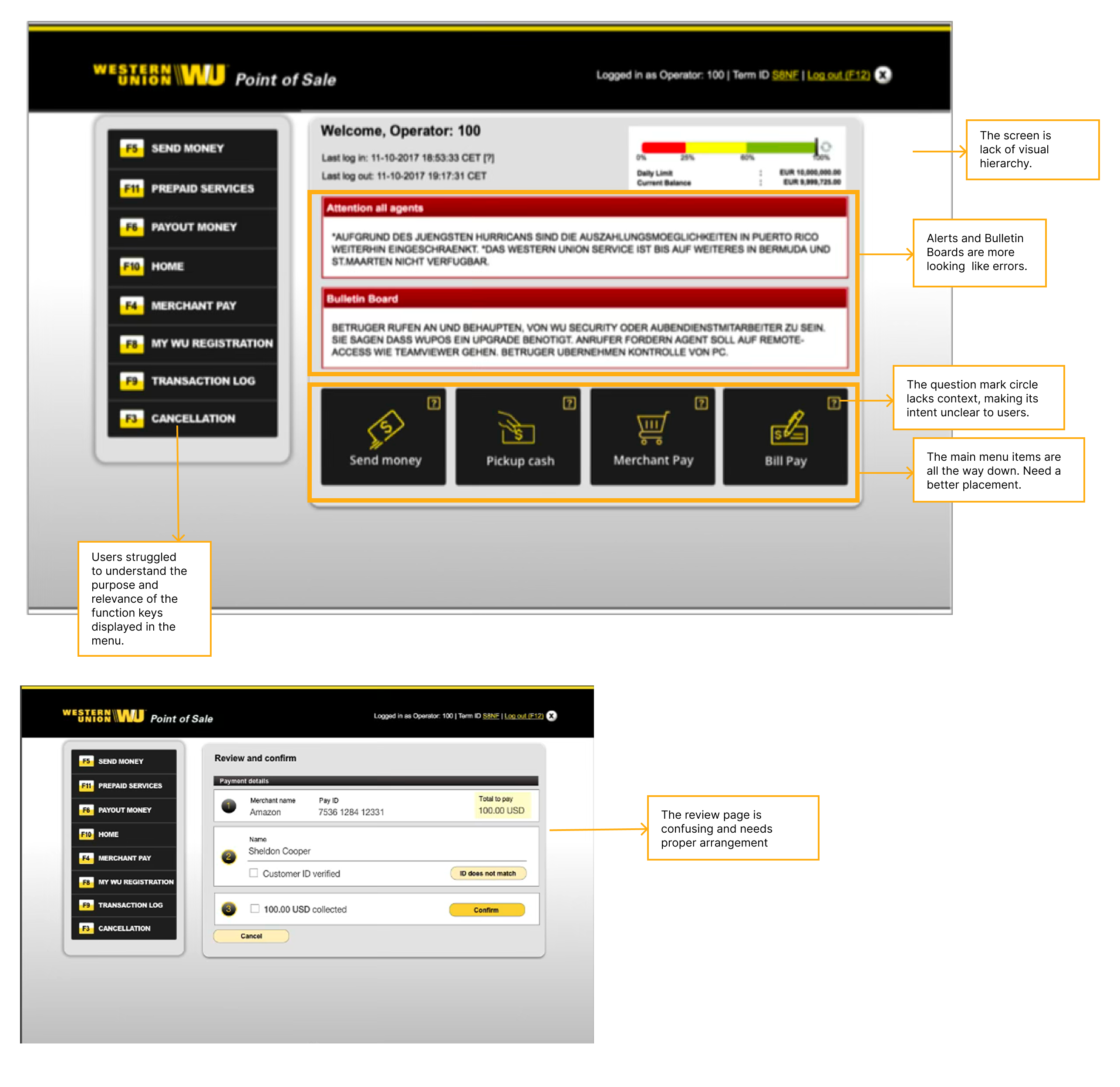
INTERVIEWField interviews with long-serving agents showed the existing Point of Sale screen buried its main actions and made routine notices look like errors.
The project started with a field visit to a Western Union agent location and interviews with agents who had served customers for many years. To see the experience end to end, I also mapped the existing screens into a brief user flow chart. Five pain points came out of that work, and each shaped a specific design response.
Key User Pain Points
- The home screen lacks visual hierarchy.
- Alerts and Bulletin Board notices look like errors.
- Main menu items sit all the way down the screen
- Lack of feedback: No clear indication of what happens after submission.
- The review page is confusing and needs proper arrangement.
- Function keys in the menu are unclear
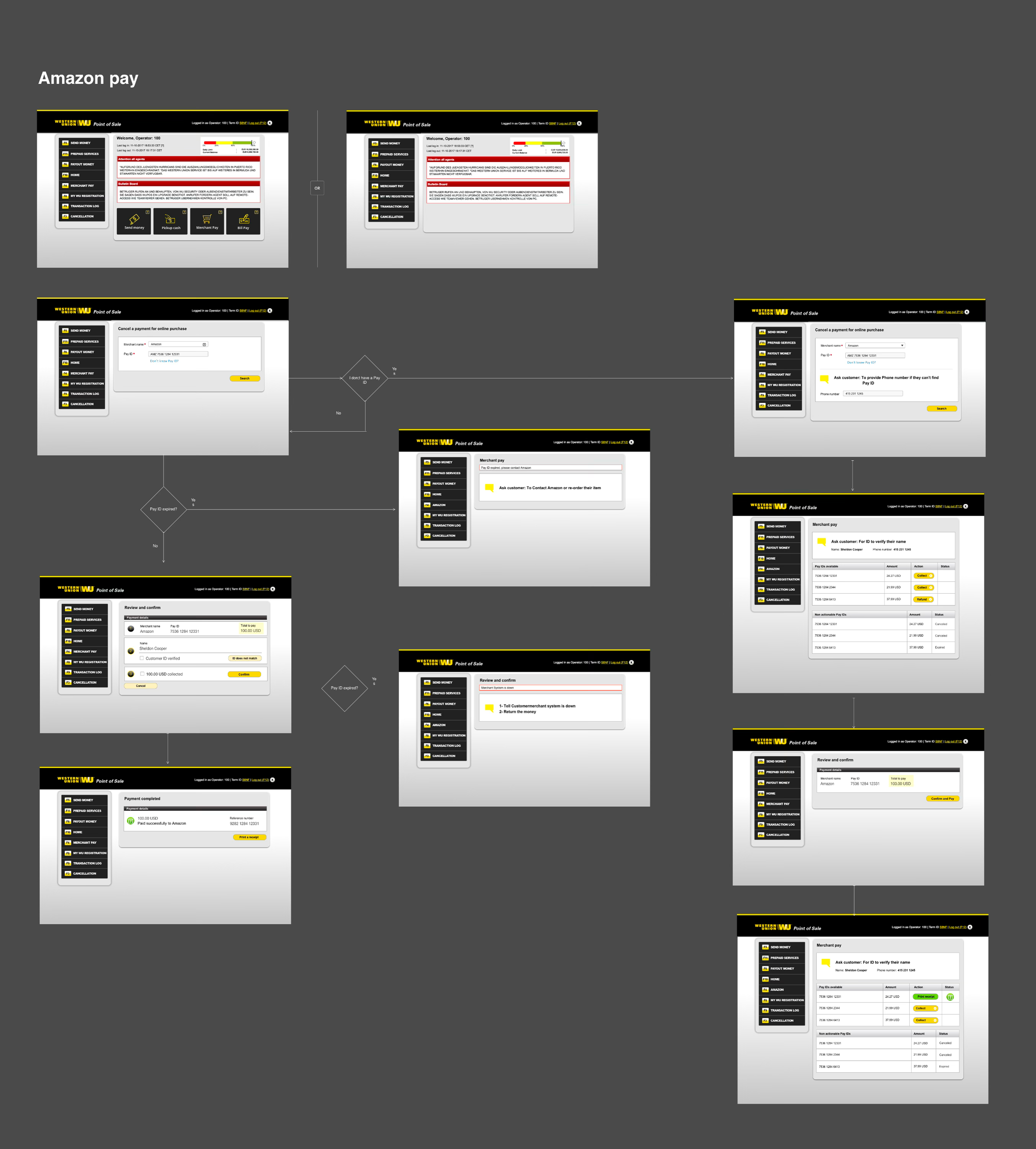
USER FLOW CHART
In order to understand the user experince hosistically. I created a brief user flow chart of the existing design.
02 — Ideation
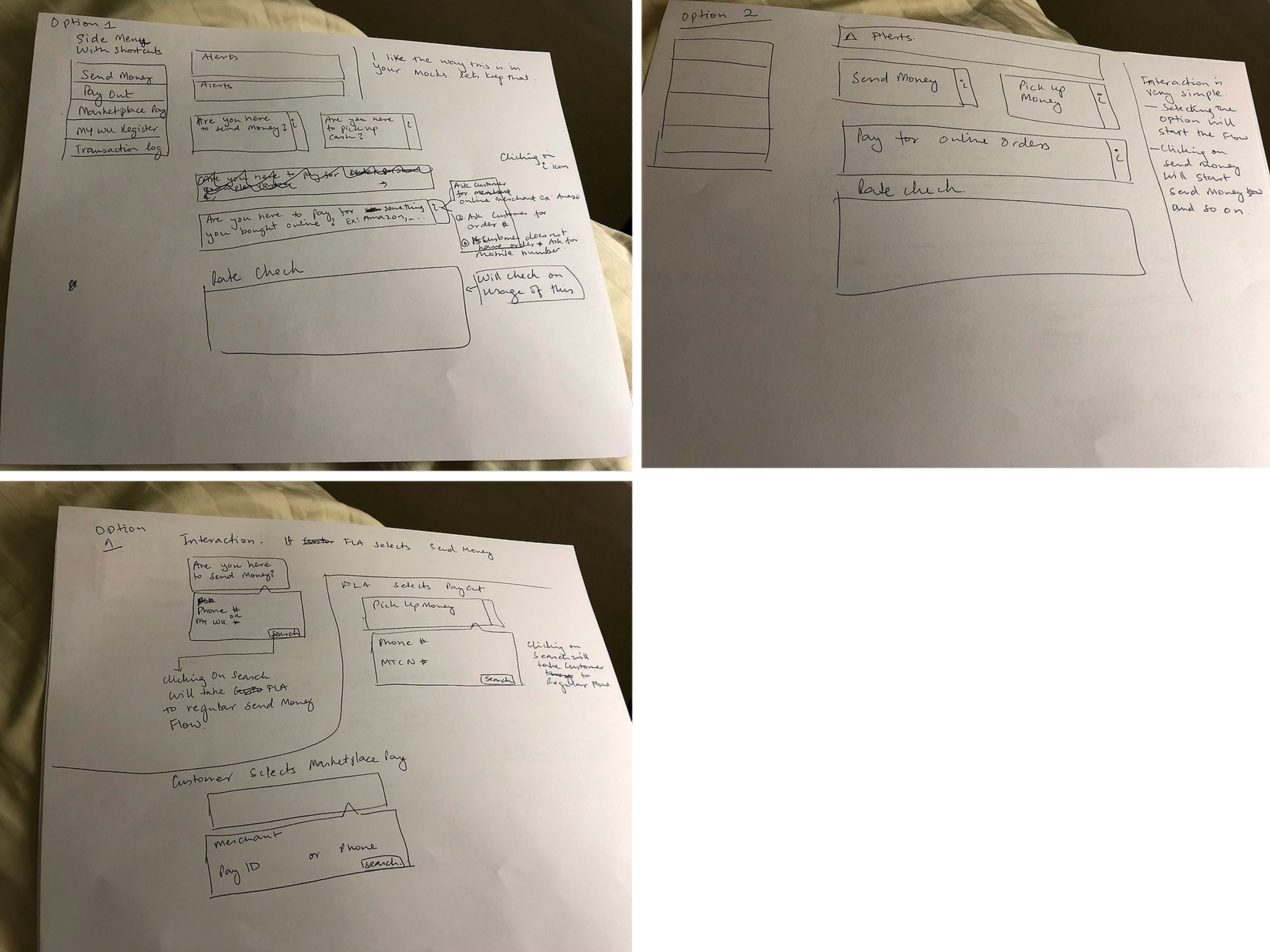
The team turned the research into concepts through brainstorming sessions, and I captured the strongest ideas as paper sketches.
Sketching on paper kept iteration cheap: layouts for the service menu, the review step and the order-check screen could be compared and discarded quickly. The sketches set the structure that the high-fidelity mockups then filled in.
03 — Design
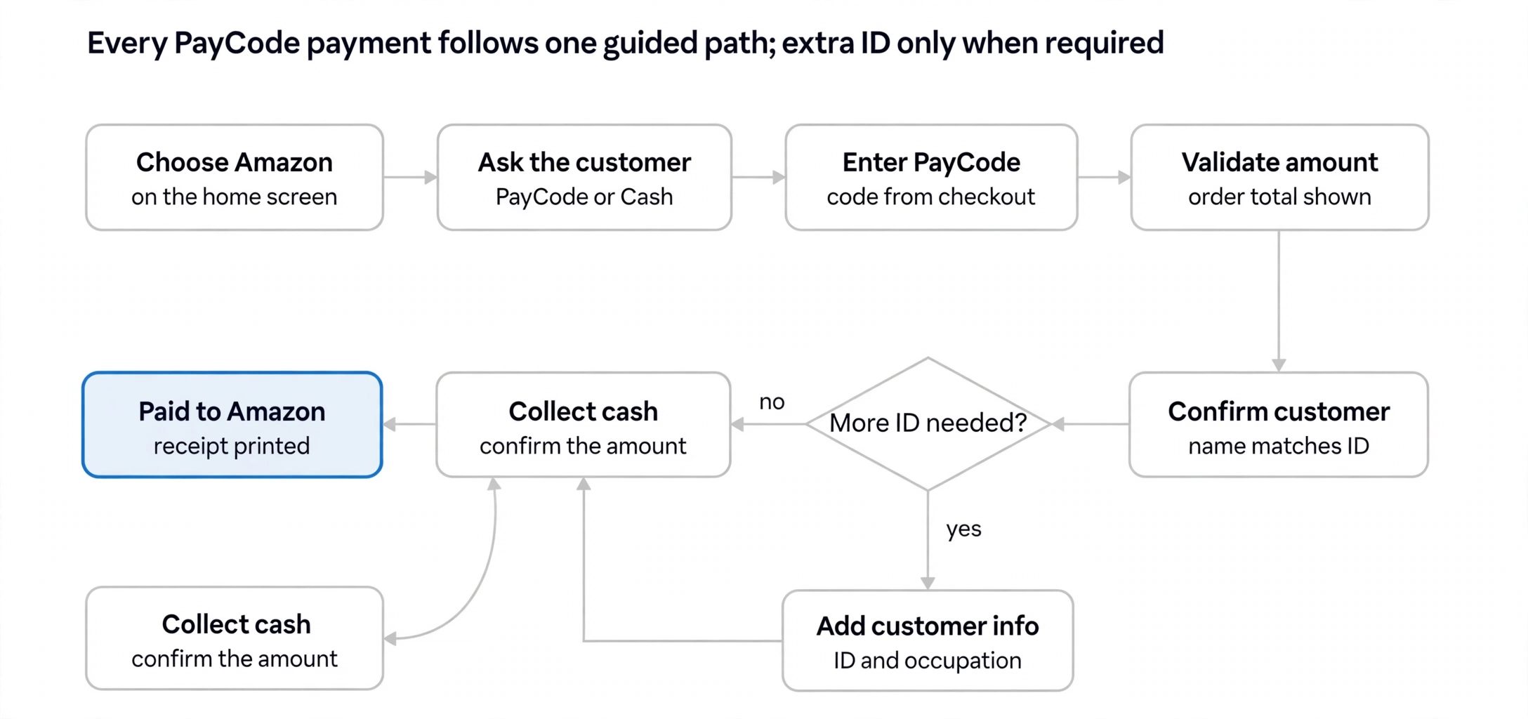
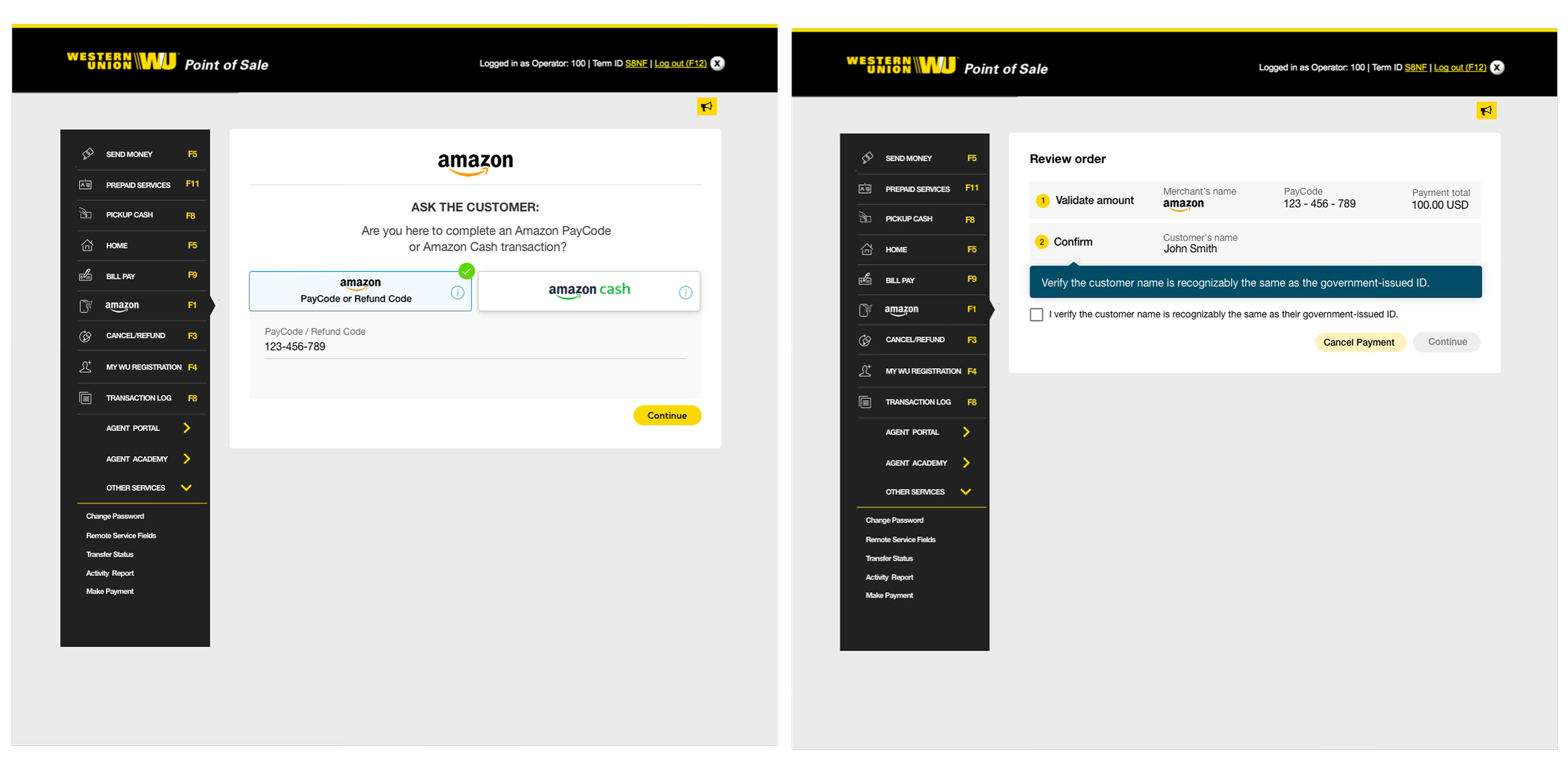
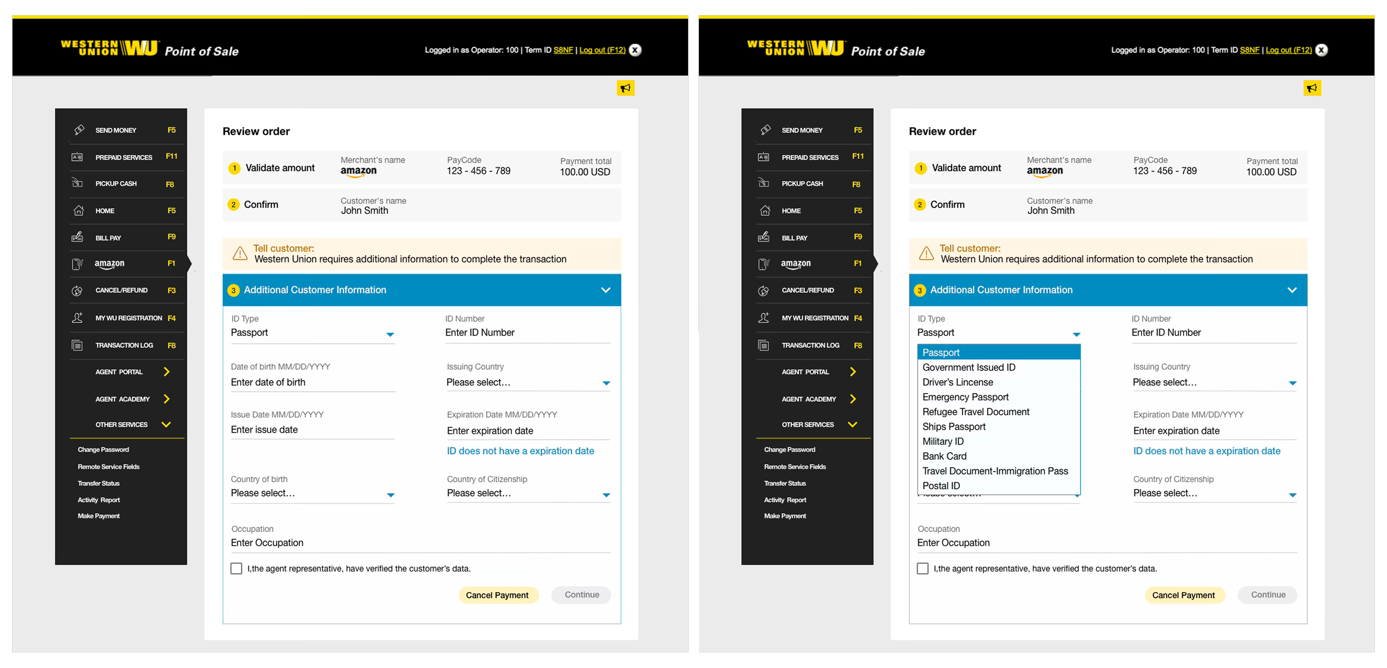
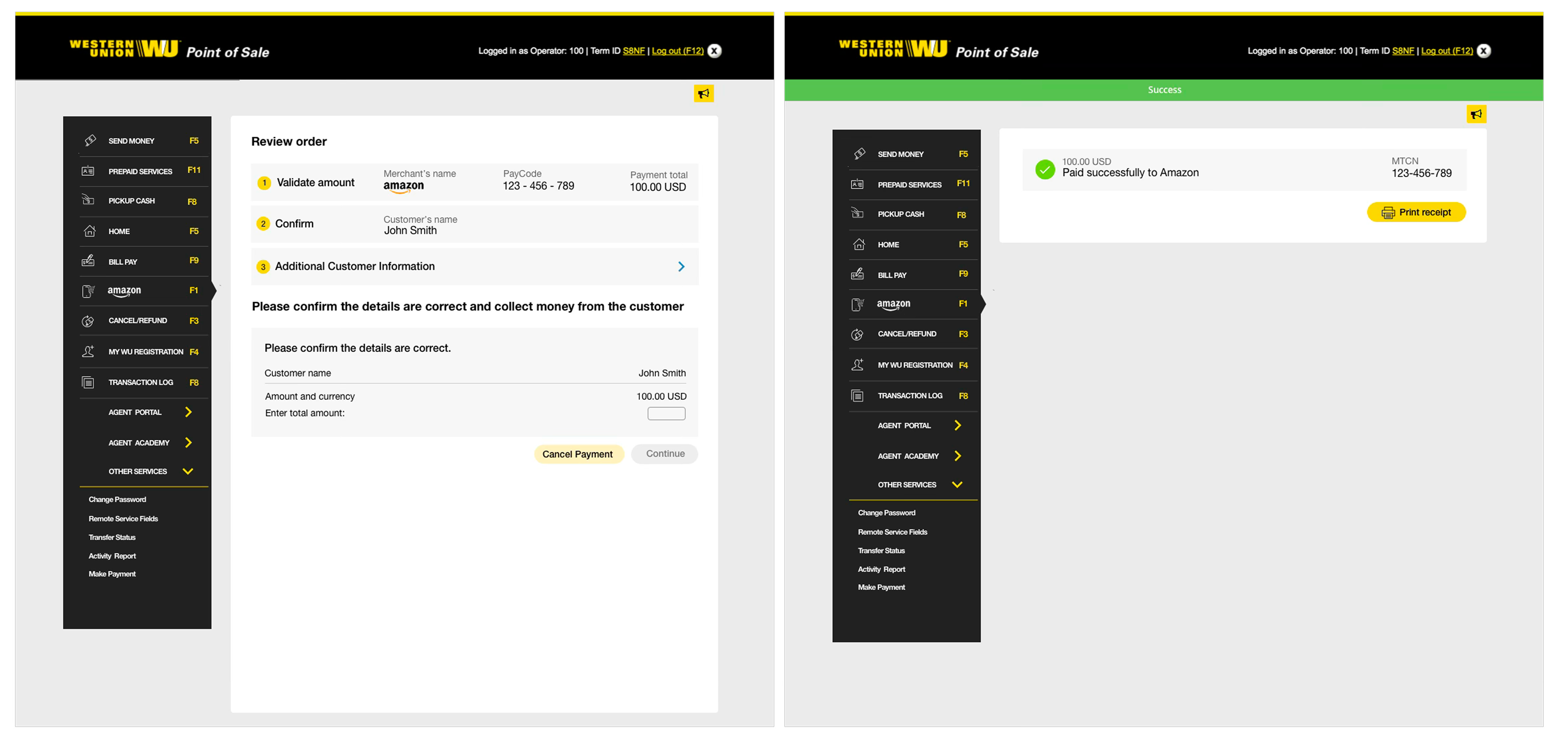
The redesigned Point of Sale walks the agent through a PayCode payment one prompt at a time, so the screen itself does the training.
High-fidelity mockups brought the research fixes together. The home screen opens on "Select a service to begin" with Amazon as a primary tile, and a one-time explainer introduces Amazon Cash, PayCode and Refund Code. From there, prompts such as "Ask the customer" tell the agent exactly what to do next.
04 — Validation and results
* Customers in Latin America and the Philippines described PayCode as an easy way to shop on Amazon without a credit card, with one completing a payment in about 5 minutes.
* High-fidelity mockups went to stakeholders for review before development, so feedback could be folded in early and rework avoided later. After launch, customer feedback centred on access and speed: