Streamlining a Modal Workspace
Redesigning a complex loan-allocation workspace to help users distribute monetary amounts and percentages across multiple loans more efficiently.
01 — Problem Statement
In order to simplify the UI of the previous team's design, allocation features were placed behind dropdowns—which proved cumbersome, adding tens of extra mouse clicks to the experience. This led to negative user feedback, that they wouldn't even recommend the product to their colleagues.
02 — Current State
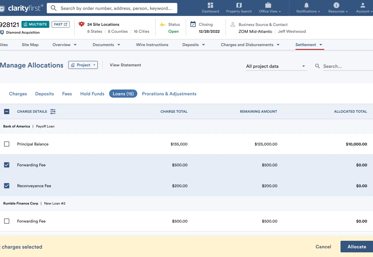
Users would select one or more loans from the table to allocate their monetary amounts, and select the Allocate button in order to begin customizing the allocations.
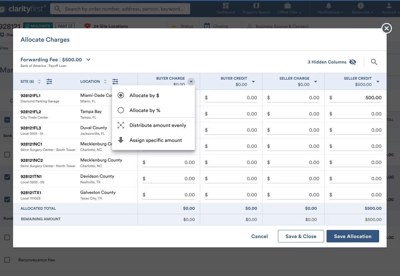
Users would then be presented with a modal workspace to customize allocations, however it was met with negative feedback from users that many of the basic features were hidden behind dropdowns, resulting in a broken and cumbersome user flow.
- Ease ability to move from one loan to the next, without a dropdown
- Make it simpler to use the allocation features that are currently behind dropdowns
- Simplify the Save CTA buttons
Feedback highlights and requests included:
03 — Strategy
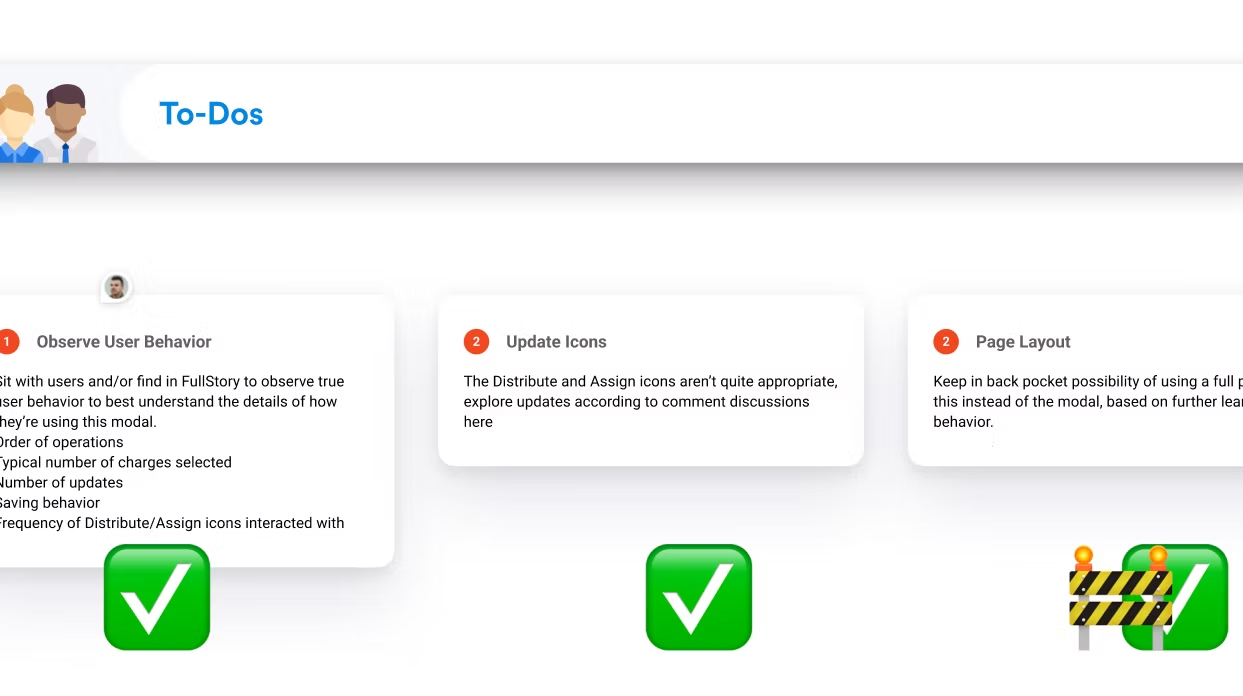
Before diving into explorations I needed to learn directly from users how they were currently using the modal, and hear from them what the pain points were.
04 — Ideations and Explorations
This project having a quicker time frame, I jumped into hifi designs rather than my usual time spent in lofi wireframing.
Since the product is extremely content dense, and the existing modal was already bursting at the seams, I wanted to explore how a full page experience could function while also utilizing familiar elements from the modal.
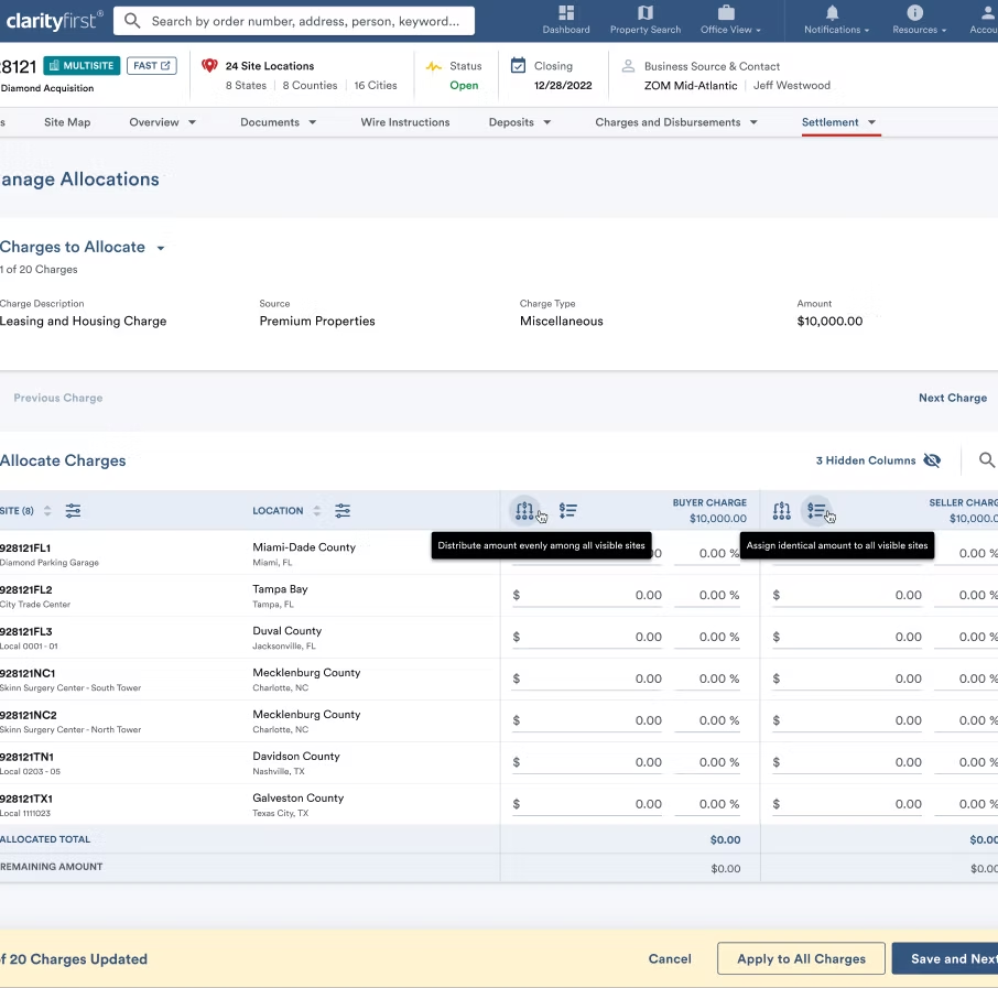
CHARGES CAROUSEL
Since the product is extremely content dense, and the existing modal was already bursting at the seams, I wanted to explore how a full page experience could function while also utilizing familiar elements from the modal.
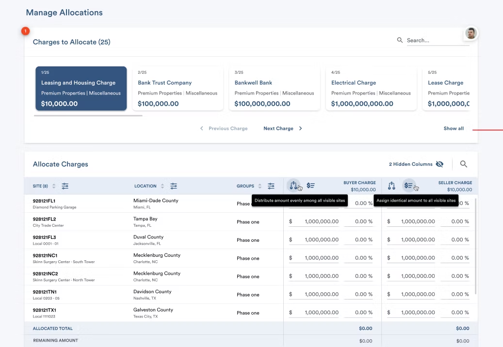
TABLE FOR EACH CHARGE
An exploration to help with focusing on one loan at a time.
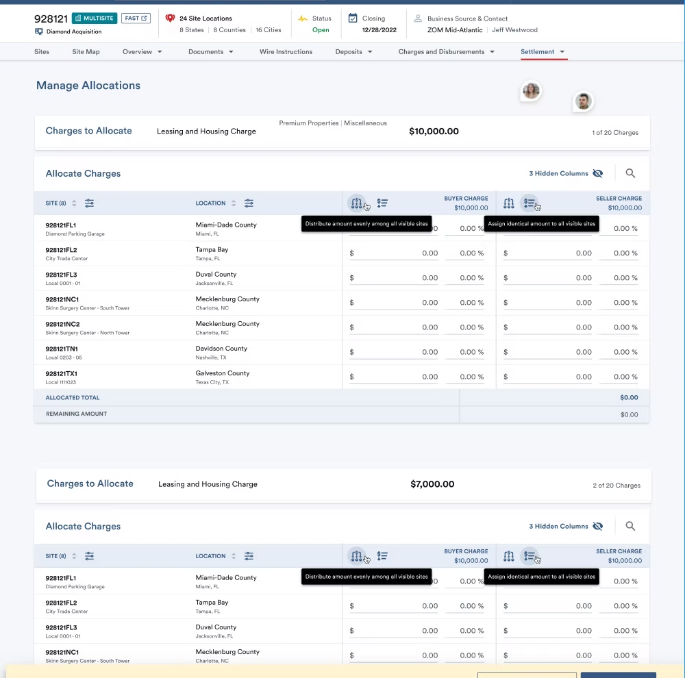
INDIVIDUAL VIEW CAROUSEL
An exploration to help with focusing on one loan at a time.
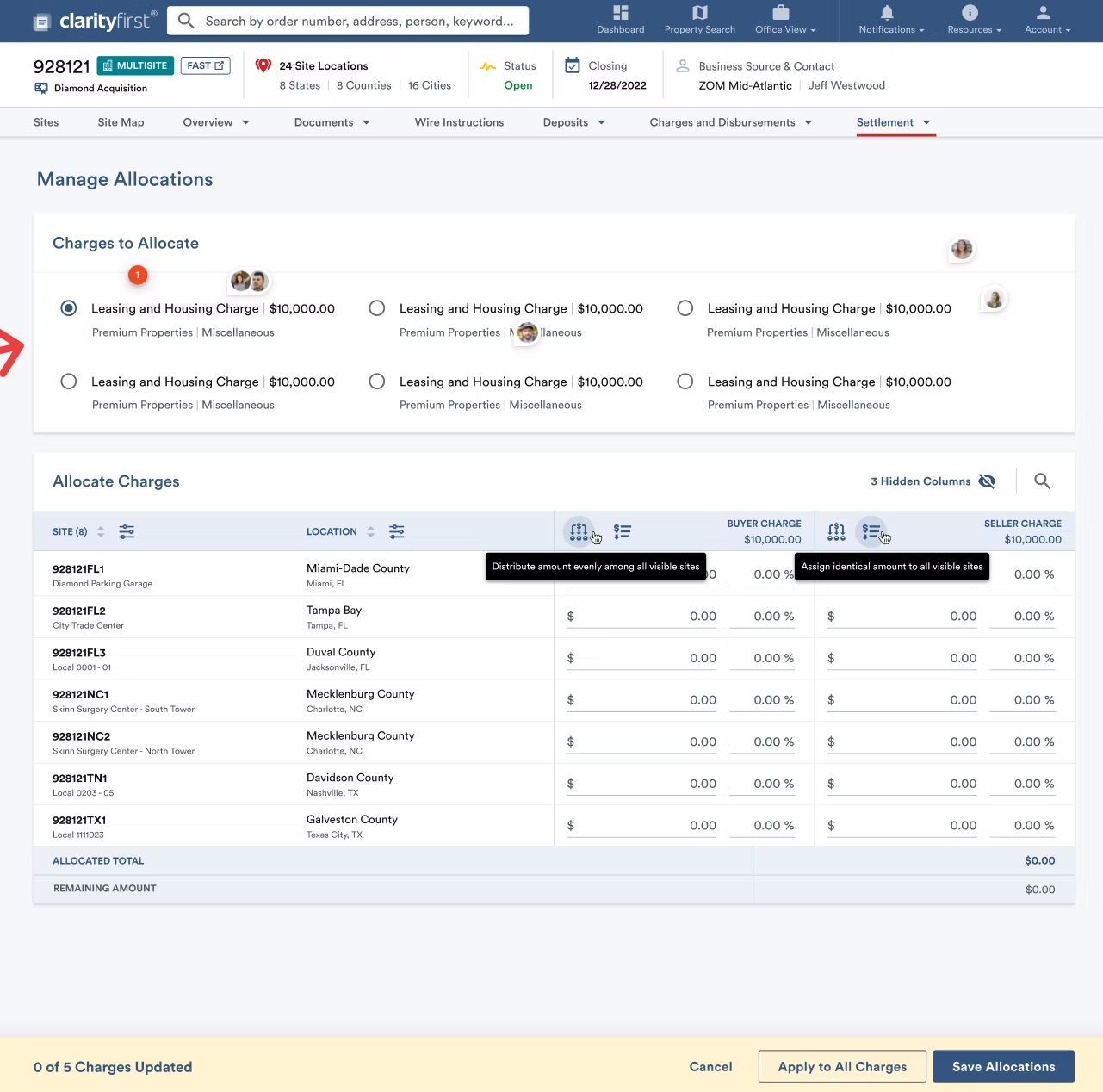
RADIO BUTTON LOAN LIST
Exploring how to show a list of all the charges selected for allocation, while allowing easy selection from one to the next.
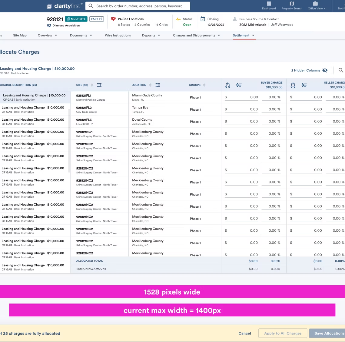
MODAL IN FULL PAGE
Experimenting with simply bringing in the same table from the modal into a full page view, with the charges listed in a new left side column for ease of selection.
05 — Design Iteration
After consulting with our demographic users again, I moved forward with enhancing the existing modal, as this would also utilize the existing development framework.
MODAL WORKSPACE ENHANCEMENTS
* Charges or Loans now display in a list in a new left side column—this allows users to quickly select between the tens of them that they work with in a single session.
* Monetary and percentage inputs display by default, instead of having to click into a dropdown to reveal the percentage input—users can easily input according to their preference, and the opposing input automatically calculates.
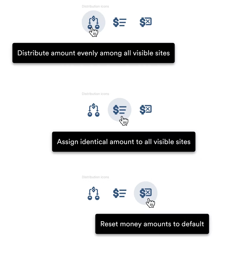
* All functions that had been hidden behind a dropdown were extracted, with new icons designed—allowing users to quickly evenly distribute larges amounts, distribute specific amounts, or zero-out selections.
* Simplified Save and Close CTA button
* Apply Changes to All Charges CTA allows users to apply updated allocations to all charges, if relevant—this saves an untold amount of time for users with one click.
* Progress tracker near top left easily shows users how many charges are currently fully allocated as they progress through their flow.
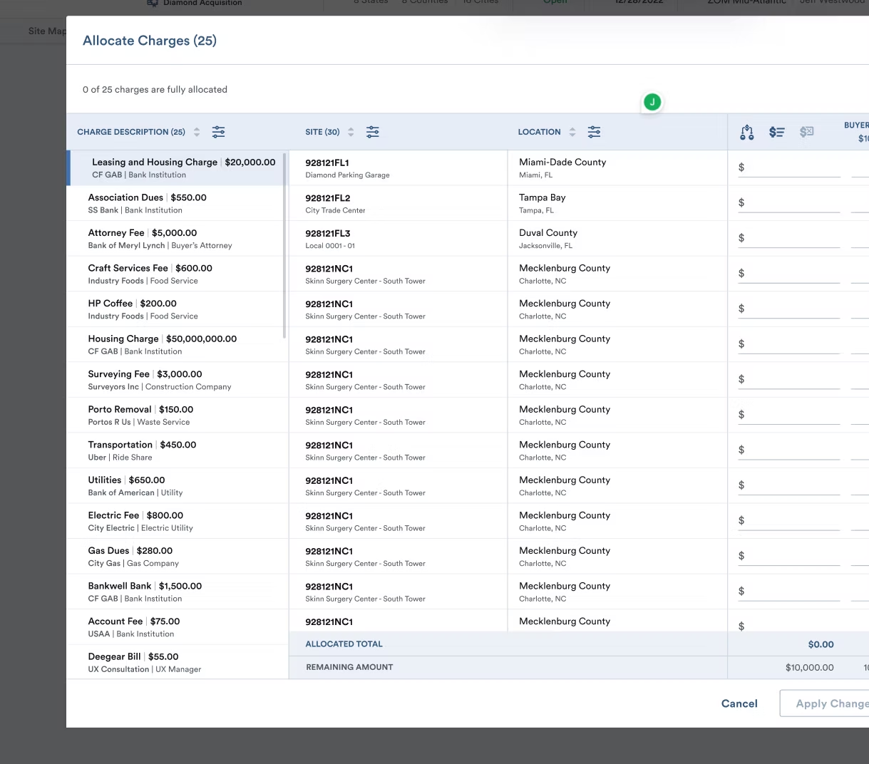
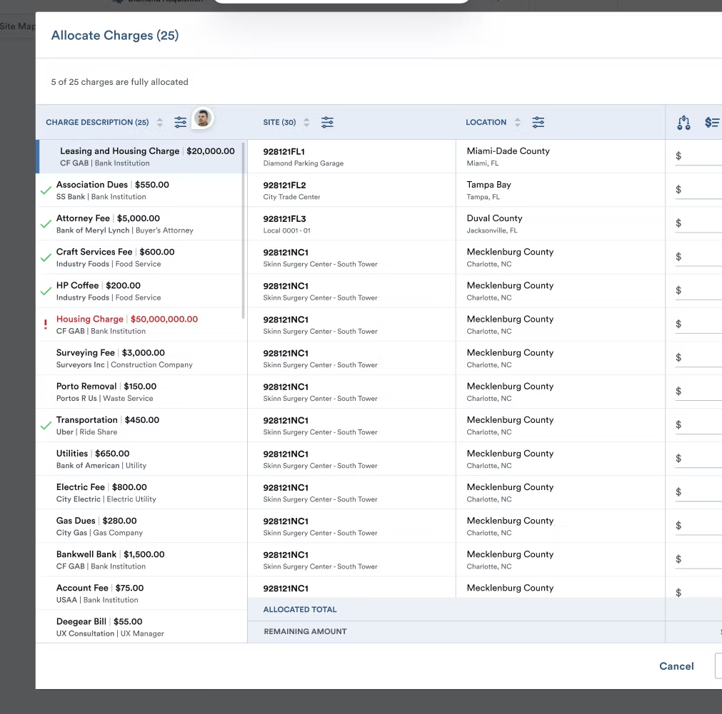
ALLOCATION STATUS ICONOGRAPHY
As each charge or loan is allocated, iconography was added to help users quickly see which are under, over, or fully allocated.
The modal can't be saved if any charges are over allocated, so users can easily scroll through even lengthy lists to see the red charges that are over allocated to fix before saving.
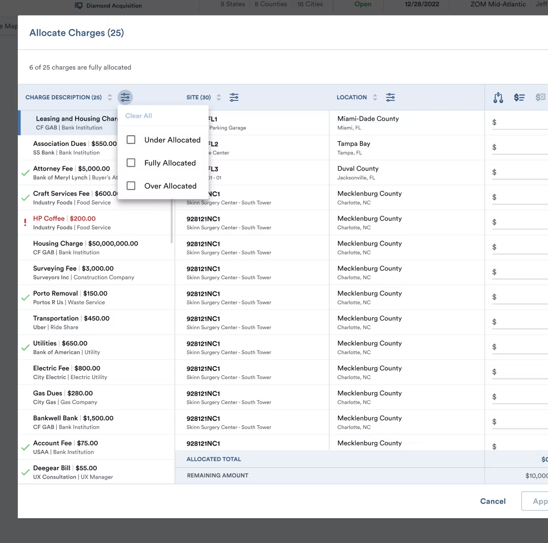
FILTER ABILITY
As each charge or loan is allocated, iconography was added to help users quickly see which are under, over, or fully allocated.
Additionally, allowing this new charges list to be filtered according to allocation status allows users to customize their work flow and efficiently move through their tasks.
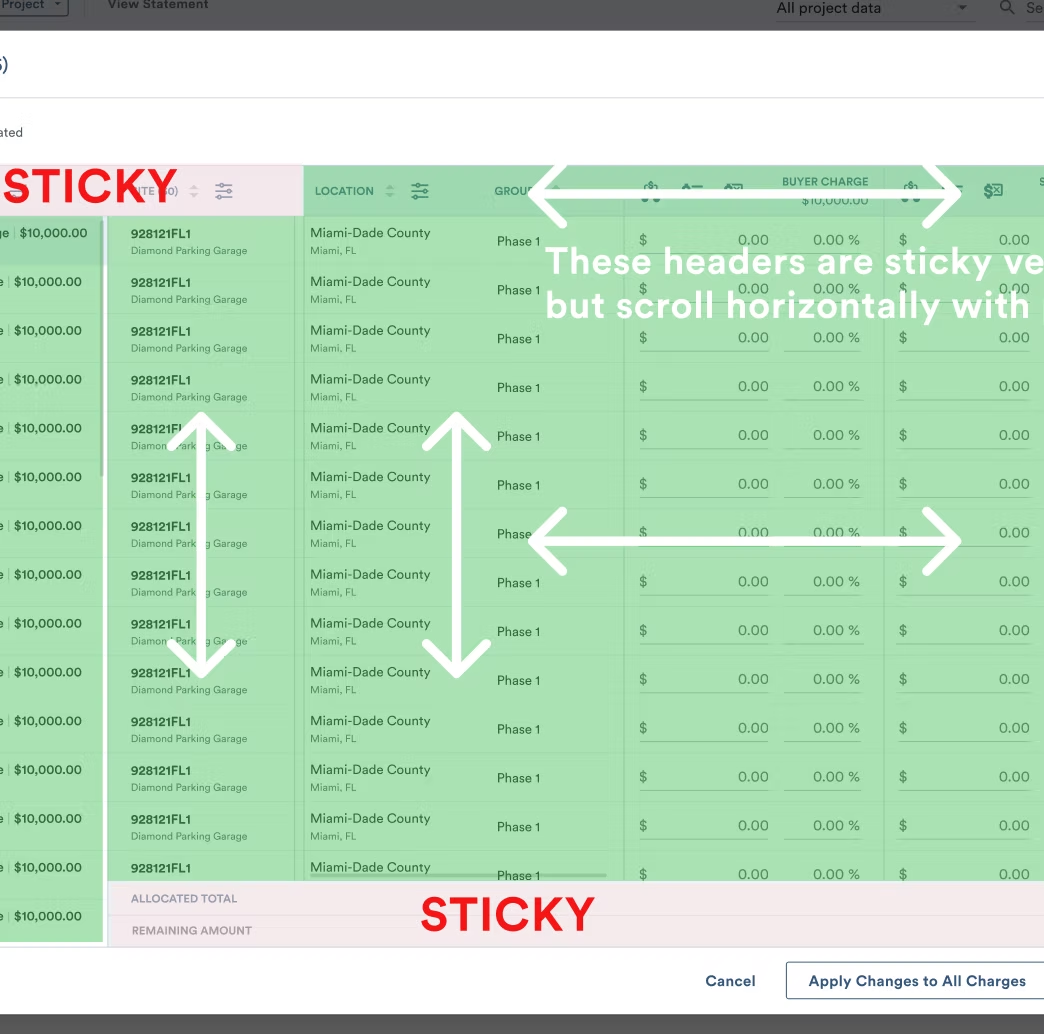
SCROLL ZONES
NEW ICONOGRAPHY DESIGN
In addition to extracting the distribution features out of a dropdown for easy access, redesigning their icons was needed along with new tooltip guidance.
06 — User Feedback
"The updates to the loan allocation modal are a thing of beauty—thank you so much!"
